I’ve recently began the long arduous journey to port my games from a windows phone / Silverlight / xaml code base to a platform independent framework (using GameMaker). The name under which I’ve published those games is ‘Escape Development’. This was OK at the time, but it’s been starting to bug me recently. I wanted a new name / logo which didn’t have any connotations associated with it.
These days you’ve really got to start with the website and work backwards. There’s no use coming up with some cool name only to find out that there are 20 other names exactly like it. I wanted a short name that was easily identifiable with the games that I publish.
Pretty much every 3 letter website is taken so you’ve got buckleys of getting something there. I had a crack at a few four letter words, but five there were a lot more available. I got a list of a about 10 or so and gradually started whittling them down. I settled on Ruxar.
OK name sorted, now logo time. This is something that really conveys the spirit of your games. So you want to carry that through in the design. My games are colourful, tongue in cheek outings that generally don’t take themselves too seriously.
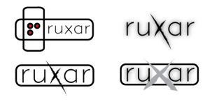
My first got at the logos was really just focusing on the text and using some variations around the X to add a bit of flare. These all seemed a bit too serious though.

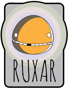
Next up I tried adding a character to the designs. I liked this concept but the execution was a bit wonky. Back to the drawing board / sketch pad.

This is the final result. I’m really happy with it.
